I keep getting emails requesting a PDF of the paper I wrote with Oliver Wings (link to blog post) on how to do photography for photogrammetry. That’s because the download link on the journal’s web page of the article is so well hidden that most people miss it.
Yeah, once again I write that it has been awfully quiet here, that I have been and am hellishly busy. All true, just as it was last time. And the time before. In fact, my workload has gone up, not down. So, should I revive this blog? And if so, with what type of content?
The answer seems pretty clear to me! In its hey days in 2016 and 2017 dinosaurpalaeo had over 70k visitors per year. The highest number of views per day was well over 1,000. Ever since the number of visitors and views has dropped steadily. However, the most viewed post, my continuously updated tutorial on how to handle a project in Agisoft Metshape (previously Photoscan) still had thousands of views last year, and I keep getting comments and emails thanking me for the post. Another well-received post is the one on rainy day zoo visits. It seems, most viewer come here not for dinosaurs, but for photogrammetry and via online searches of terms like “zoo rain” etc.
Well, I still love zoos, I still am firmly convinced that zoo visits are a time well spent for palaeontologists. And I still am firmly convinced that zoos offer more when emptier, hence my preference for sub-optimal weather. However, professionally I have by now shifted even more towards 3D scanning than was the case in 2016/17. As a consequence, my expertise has grown to the point where I can rightfully claim to be one of the most experiences vertebrate palaeontolgists with regards to surface scanning and the use of the resulting data.
So, should I continue posting whatever comes to my mind, wandering wildly from anything vaguely dinosaur-related to highly technical articles on the is and outs of photogrammetry and software to handle the data with? Or should I focus?
Well, gee, the traffic tells me what to do!
So, dinosaurpalaeo will become a more focused dino&methods blog from now on. I think. Or not…..
There are a large number of companies out there selling a large number of different scanners employing all kinds of methods for 3D scanning. LIDAR scanners, structured light scanners, small laser scanners, mechanical arms with and without lasers attached, (semi-)automated photography sets capable of delivering 360° or freely rotable panoramas and photogrammetry-suited image sets – and what not. It’s a zoo out there. And any company you ask is 100% certain that one of their products offers the (in capital letters and bold type, underlined), THE perfect approach for your digitizing needs. Often at the cost of an arm, a leg and your firstborn (if you are so inclined; YMMV for those intent on remaining sine prole), but hey, whaddayawant? Do you want the perfect model created while you sleep or scratch the itch on your nose, then pay the price! And many out there are willing to pay up or stick it out with a DSLR and manual photogrammetry.
Well, not I! Not that I mind manual photogrammetry. My wonderful digiS 2015 project was all about manual, free-hand photogrammetry. Not even the luxury of a tripod was planned in (nor could it one have been used). And the models we create are beautiful, and over 90% of the photo sets are good enough to produce high-quality models: low-tech FTW!
On the other hand, I must admit that I am very glad that (contra initial plans) I didn’t have to photograph all the bones myself. Instead, much of the grunt work was done by two colleagues, Bernhard Schurian and Matteo Belvedere. And whoever of us went down to the dark and dank basement to photograph bones came back out an hour or two later with arms and shoulders hurting and sweat streaming down the face.
So, is there a middle ground? Can you do mass digitizing for a reasonable price? With sufficient flexibility that you can scan both small and big specimens, do not need a dedicated room, do not need days on end to set up equipment and take it down, and without the need to transport all your specimens to hell and back?
Here’s one way!
This is a photogrammetry rig that I designed, and that got turned from an idea and a sketch into a real, physical mechatronical system by engineers at Technical University Berlin. They deserve a huge lot of credit for their work, and also for programming a software that runs the entire thing!
Essentially, it consists of three cameras that can move vertically (2) or horizontally (1) and can tilt, and a turntable. Below is an illustration that shows the degrees of freedom:
The entire thing is computer controlled, and built to be easy to use. “Easy” starts with the fact that there is a single power plug (so the cameras get their power from the system automatically), that the system has a built-in power socket for the laptop, that all cables only fit one socket each (so can’t mix them up), and that there is only one single screen of user interface you need. It turns on with the press of a single button, which also turns it back off if you press it again.
The photo above shows where all the cables come together. The camera tilt and camera move cables have different types of connectors, and simply won’t fit in the wrong place. As do all other rig-related cables, e.g. for the lights. The USB cables for camera data transfer are color-coded. I love it, as even I can mount all that stuff correctly on the first try.
Overall, the rig is built to be transportable. Not mobile, as in “let’s lug this to that room for 2 hours of work, then bring it back”. But you can take it down in an hour, and re-mount it in maybe 90 minutes. It is easy to work for a few days in one collection room, then move on to another. Saves a lot of time and bother you would have if you had to move specimen all over the place to bring them to the scanning station. Actually, any future versions will come in two or three boxes, as the complete rig is a tad too heavy to lug around.
The overall size is also adapted to typical museum needs. You can digitize specimen with a maximum length of somewhere between 5 cm (using macro lenses) and 1.2 m (using wide-angle lenses and with a bigger turntable cover than shown above), although I would recommend caution with stuff longer than 80 cm. This range covers the vast majority of specimens (except insects and small invertebrates) that you can actually move around – complete skeletons of large animals or sauropod femora are best digitized in place anyways.
So, how does this thing work?
In essence, what you do is this:
place your specimen on the turntable (ideally on a bit of support material that is soft enough to protect the specimen and is slightly smaller than it – I’ll explain later why this is important),
add scale bars,
load a scanning script that matches the specimen’s characteristics, or create one,
select a target folder for the data,
click “start scanning”,
and go and have a coffee or beer (depending on time of day).
Once the scan has finished, which can take two minutes or half an hour, depending on how many photos you ordered, you will find them in the folder you specified, ready to be tossed into a photogrammetry program.
So, how do I create a scanning script?
In essence, what you need to create is a tab-delimited CSV, which you can easily do in EXCEL or its OpenOffice equivalent. The first colum is the move command for the top camera, the second the tilt, the next two do the same for the middle camera, the next two the same for the bottom camera. The following column indicated the angle of rotation for the turntable, and then three columns contain the info if each camera is to take a photo at this step or not (a simple TRUE or FALSE entry). Here’s one:
This is a basic, standard scanning protocol for an object that is roughly box-shaped, with all sides of roughly the same length and thus fairly even changes of relief all around. As you can see, the bottom and middle cameras take a picture every 20°, but are offset from each other by 10° (alternative TRUE and FALSE values in the last two columns). The top camera takes fewer photos, one every 50° only. That’s because it is close to the “pole” of the specimen, where fewer photos are needed.
You may notice that in this very simple script none of the cameras move. That is intentional, as moving them takes time. Let’s take a look at a more complexly shaped object’s script:
Note the line where I added the red arrow! Up until there, everything is the same as above. Then, several things change.
First of all, the top camera goes off the air here. It took all the required images while the turntable goes through the first 350° of rotation.
Secondly, the bottom and the middle camera shift up quite a bit, but retain their respective down angles: the bottom one stay horizontal, the middle one stays angled down ca. 25° (10° form the script, plus the 15° is it mounted at).
The picture taking scheme stays the same: each takes a photo every 20°, and the two are offset by 10°.
What kind of object is this script for? Well, something that is much higher than wide, and is placed vertically on the turntable! Think of a bust with a high head. Or a mounted bird eagle skeleton.
What if you have an object that is much wider than long, but can’t be placed vertically? Something like a dinosaur femur? In this case, you’d alter the first scanning script so that the angles between photographs are smaller when the bone ends (with their high rate of shape change) face the cameras, and larger then the cameras are pointed at mid-shaft. And so on – depending on object shape you simply alter the script. And save it with a speaking name, so that you can easily call it up again when another, similarly shaped object needs to be scanned.
So, why this rig and not something off the shelf?
So far, all this is not very special. In the end, however, this rig is specially adapted for natural history museums with their collections that have objects varying widely in size and shape complexity, with their low budgets, and with their dearth of technical personnel: you can learn to scan with it very quickly, get excellent results, and that across or wide swath of objects typically found in collections. Also, the rig is not very expensive, but sturdy, and can be upgraded easily whenever you have money for new lenses or cameras. The model quality easily beats handheld laser scanners, btw….
Well, I’ll see what the institute that ordered it does with it – I’ll keep you posted!
Well, this is a long overdue post, and I could have saved myself a lot of emailing if I’d written it earlier. Basically, it is a sibling, even a twin to my tutorial on how to handle a project in Agisoft Metashape. Over the course of the last two years I have been using Metashape less and less, running most projects in Reality Capture. Not because it is “better” in any overall sense – both programs have their strengths and weaknesses, and I am glad to have both available. However, for my typical objects Reality Capture (RC) produces most models much faster and with a more comfortable workflow. If that fails, I typically toss my data into trusty old Metashape, which normally gives me a very good model. In a certain sense, RC is fast but princess-and-the-pea, more prone not to calculate a good alignment, and Metashape is slow but extremely robust and reliable.
One thing that also needs to be mentioned here is that RC has a very annoying bug: it will freeze and crash quite often when coloring a mesh, and sometimes also when calculating or texturing. Sometimes, re-running the project helps. Sometimes, altering the settings helps. Sometimes, removing a photo or two will help. But that means investing the time for running the model again and again and again. Therefore, I often turn to Metashape in these cases, too.
EDIT: this bug has been mostly fixed in the latest release! /Edit
So why use RC at all? As mentioned, it is faster. MUCH FASTER! So much faster that it is worth all the bother. Additionally, it has by now acquired all the little gimmicks I need, such as automated detection of coded targets.
There are several versions of RC; I here assume you use a photogrammetry capable one without Command Line Interface (CLI).
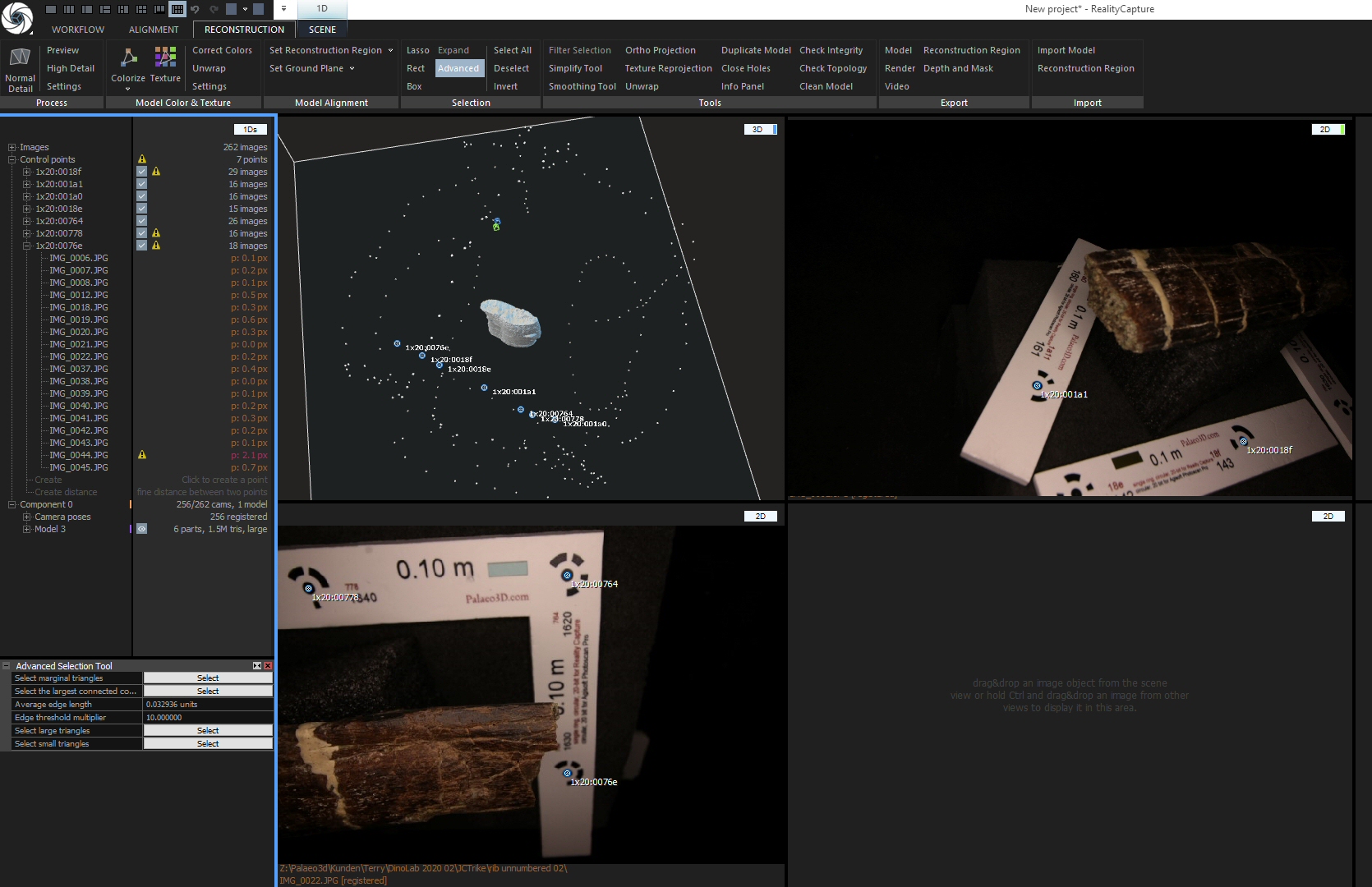
Let me begin with a quick overview of the user interface and how to adapt it to your purposes. If you are already familiar with it, you can jump down to the “Loading images” section.
When you open RC you see something like this:
I’ve marked several things here:
The blue arrow points at the quick access bar that allows altering the layout of the user interface, i.e. the number and placement of screen parts or ‘cells’ as RC calls them,
the red arrow points at the tabbed(!) application ribbon that holds all the text or icon buttons you need to work the program,
and the yellow and green circles shop the name tags of the two cells this layout offers.
The left cell says “1Ds” on top (yellow circle). This cell details the structure of your project – currently, all is empty. The green circle shows the name of the other cell: “3D”. Unsurprisingly, this 3D view of your project is also still empty.
During the workflow, it may be necessary to change the “1Ds” cell to previews of the images. You can do this by clicking&holding the name tag and choosing “2Ds”. Also, you will need to change the layout to one with more cells. I usually use the one that has a “1Ds” view on the left and six more cells in two rows on the right. You can switch to it by clicking the appropriate icon in the quick access bar (blue arrow). If you hover the mouse over it, a pop-up will show “1 + 2 + 2 + 2 Layout”.
You will also need to jump between the various tabs of the application ribbon. They are named on top of it: Workflow, Alignment, Reconstruction and Scene. When you click on of the words, the appropriate tab opens up – but NOT necessarily with all the icons and commands you need! What is shown depends on what cell you have active! The active cell has a blue frame around it. Just click a cell to make it active. Also, some commands are there several times, in different tabs….all a bit confusing, initially.
The RC icon at the top left of the screen is, btw, both an access to the main menu for saving and loading projects, and the exit button (if you double click it). Be warned……
OK, now you know all you need to know for us to proceed to
Loading Images
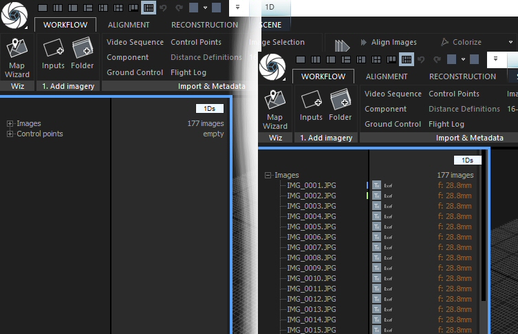
You can add images by either dragging&dropping them, or by importing them via the WORKFLOW tab’s “Add imagery” section. Two icons allow either adding files individually (obviously, you can select may in the explorer window) or of an entire folder.
Once images have been loaded, the “1Ds” windows changes:
The number of loaded images is shown, and if you click the small + sign to the left of the word Images you get to see a list.
For each image, there is an icon showing if it is included in texture calculation (the grey square with Tx written on it). Click it to exclude the image. Next to it there is either text says “Exif” if there is sufficient EXIF info with the image, or nothing. And on the right the focal length is given.
You can’t remove images from a project, but you can block them from being used. Simply select them by clicking (CTRL or SHIFT to select several) and press CTRL-R to strike or re-activate them.
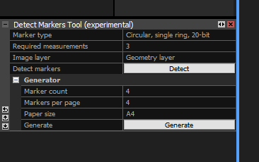
Now, it is time to detect markers (assuming you used coded targets) for later scaling the model. You can do without, but there is practically no reason not so use scales with coded targets these days, so I won’t get into that now. If you need scales, buy some from me: Palaeo3D Scale Bars
Detecting Coded Targets
Switch to the ALIGNMENT tab. In the ‘Constraints’ section, select “Detect Markers”. This opens a dialogue window at the bottom left, under the “1Ds” cell. You may have to move the boundary between them up by clicking-dragging to see the entire dialogue.
Select the appropriate type and the minimum number of images a target must be found on to be recognized (Required measurements). I’ve always used 3, which sorts out false positives quite well but recognizes targets even if a scale bar is only in a few images.
Click “Detect” and wait a short while. Now, your “1Ds” cell will look like this:
You need to click the small + to the left of “Control points” to see them. For each point, the name and number of images it is on is shown.
OK, on to….
Alignment
As you already are on the ALIGNMENT tab of the ribbon, you can simply click “Align images” in the ‘Registration’ section. Afterwards, you’ll see both a sparse point cloud in the 3D view(s) you have open, and one/a list of component(s) in the “1Ds” cell. Like this:
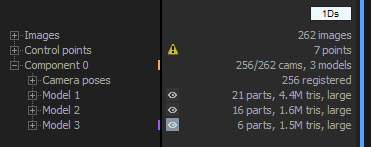
The upper example shows how RC creates “Components” – sets of images aligned with each other, but not aligned with any of the other images. Below, things worked well: there is only ONE component.
If your project gets split into several components of significant size, i.e. if you feel the biggest component needs more images to give you a good model, just click “Align images” again. This will lead to fewer (ideally, one) component(s). If not, you can open the Alignment settings (click “Settings” in the ‘Registration’ section of the ALIGNMENT tab of the ribbon) and change “Merge components only” to yes to try a third time.
If all that fails, I usually abandon the project and either try by adding photos in increments or turn to Metashape.
Once you have one component that has enough images aligned, it is time for model construction.
Mesh building
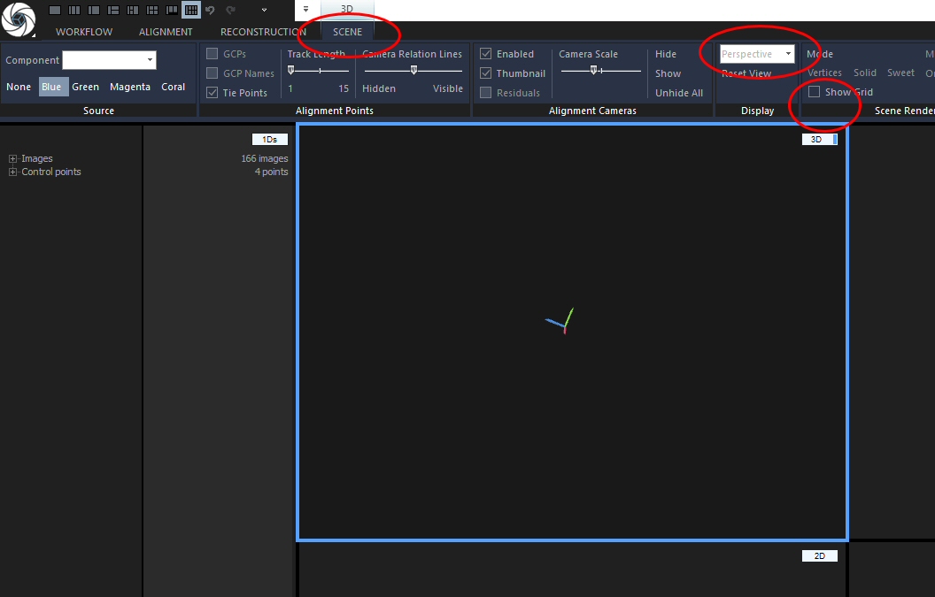
RC does not give you access directly to the point cloud, as Metashape does, but builds a mesh directly.
Before you start RC on building the model, you should adjust the reconstruction box – the volume that the program will work on. In the “3D” cell there should be a white box around the sparse cloud. If there is non, create one by going to the RECONSTRUCTION tab and clicking “Set Reconstruction Region”. Now, click the white outline of the box to make it editable. For easier editing, I always change the view to parallel projection and turn off the grid. You can do both in the SCENE tab, but you MUST activate the “3D” cell first by clicking into it. Otherwise, the commands you need will not be shown because they do not work in other views. Use “Show Grid” to toggle it on and off, and use the pull-down menu in the ‘Display’ section to alter the view as it fits your needs. I’ve circled the tab header and the commands in this screenshot:
Now, after you have clicked the box, it will show colored dots outside it and arrows and curves at the center. You can alter the size by clicking&dragging the dots, and you can rotate the box by clicking&dragging on the curves. Be careful not to accidentally grab an arrow, as then you will shift the entire box happily around, which is usually unnecessary bother.
Switch back to the RECONSTRUCTION tab of the ribbon now and click “Normal Detail” all the way on the left. (Or click High detail to get a higher detail model). This will take a bit longer, and it requires an NVIDIA GPU. The result ideally looks something like this:
Uh, well, that’s a lot of stuff all over that I don’t want or need! Notice the small bone shape in the middle, a piece of a rib? That’s what I wanted…. (well, I left the box really big to ensure I got a boatload of stuff to show you here. Now to now delete it…. – a smaller box means less junk).
You can see one important advantage of RC here: notice how the bone is free-floating? I can assure you that it didn’t float in space when I photographed it. And that I didn’t go to any extra trouble to make a special support for it that was totally translucent. No, there is ample support material in the images, which is the source for all the junk around the bone in the model – BUT the model itself is free from it! That’s because RC checks if there is “something” between the cameras and the dense part of the sparse cloud, and if there is, it won’t get built! And that makes the next task so ludicrously easy: cutting the model down to the desired object!
Model editing
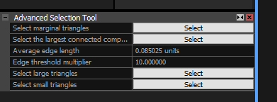
Stay on the RECONSTRUCTION tab and select “Advanced” in the ‘Selection’ section. This opens a box dialogue in the lower left, where you can click the SELECT button to the right of “Select the largest connected component”.
This is what you get: the largest component is highlighted in orange.
If, as is the case here, the highlighted part is NOT the desired object, click “Filter Selection” in the ‘Tools’ area. Rinse and repeat, until the highlighted bit IS the desired object, click “Invert” in the ‘Selection’ area and THEN “Filter Selection”. Now, all that is left is the object you wanted, and the “1Ds” cell looks something like this:
As you can see, RC doesn’t EDIT a model, but makes a copy and edits that. This way, you can always go back if needs be. However, it also means that the project save gets a lot bigger. Therefore, delete the old models now: if you hover the mouse just to the left of the eye icon, an X icon turns up. Click it to delete! RC will cross out the model, and after a few seconds (time to un-do an erroneous delete) it will be gone.
What are you saying? Your model is connected to some of the junk? Well, you can use the “Lasso” tool from the ‘Tools’ section to select the polygons causing the connection, and “Filter Selection” to remove them. If the resulting hole in your model is tiny, all is well. Otherwise, you can export the model now, retopologize it in some other program, and reimport it.
Next up:
Scaling
I typically use the “1 + 2 + 2 + 2” Layout for this step. Click the + next to “Constraints” in the “1Ds” cell, then click the + next to the last CP in the list.
See the ugly yellow triangle? It means that one or more of the CP placements on (an) image(s) is/are bad. Could be worse than this case: there could be many, and some triangles could be red. I don’t need to tell you tha red means a bigger deviation from the average than yellow.
You can now simply delete the CP assignment from the image marked with the triangle by clicking just to the left of the triangle: an X icon will appear that deletes it. I always start with the image with the highest deviation, and work my way down, as any deletion alters the values for all other images. Once that is done, I drag&drop one image from this CP’s list into one of the “2d” cells. It will show the CP – and usually other CPs as well, which is useful – as a blue dot with its name next to it.
If the image contains a complete scale bar (as the bottom left one in the example above does), the distance can be marked right in this photo. Otherwise, open the next CP and drag a photo into another cell. Continue, until you can see both ends of a scale bar.
Now, go to the ALIGNMENT tab and select “Define distance”. Now click&hold onto the blue CP at one end of the scale bar and drag over to the CP at the other end – within one image or in several doesn’t matter. Once you let go the mouse button, a constraint is created, connecting the two CPs. Go through all the CPs in the list until all desired constraints have been created and all red and yellow triangles are gone.
Above the CPs in the “1Ds” list you can now see the created distances. The “3D” cell also shows them as lines, orange and blue (selected). Select all of the same length by holding down CTRL (CAUTION: when you use SHIFT the program may crash!). At the bottom left you now see a new dialogue window:
DEFINED DISTANCE is the distance YOU define for the constraint. RC automatically sets it at a very tiny value that is not 0, because if you were to update while it is zero, the model would be shot. CALCULATED DISTANCE is what it currently has in the program. Now, simply enter the desired length for Defined distance! This tells RC what length they should be. Now, In the ALIGNMENT TAB, click “Update” in the ‘Registration’ section. This scales the model.
NOW is the time I actually save most of my projects. Only big ones that take long to align get saved earlier, before the mesh is built.
Next steps: coloring and/or texturing the mesh, or decimating it…. as you please! DO save before you start, because the coloring and texturing steps are crash-prone!
Color, Texture, Decimate
Color can be found in the RECONSTRUCTION tab; it’s a big icon. Right next to it is texture. Resizing goes via the “Simplify Tool”, to be found in the ‘Tools’ part of the RECONSTRUCTION tab. It opens a dialogue at the bottom left where you set the target triangle number and click OK.
Export
Obviously, you can export a whole lot of stuff, but the key interest is certainly meshes. These can be exported both from the WORKFLOW and the RECONSTRUCTION tabs, using the “Model” command in the respective ‘Export’ sections.
And that, generally, is all!
There are many other aspects to working with RC, but I sure try to take my photos in a way that allows me to use this fairly straightforward and hassle-free workflow. You should, too!
EDIT 06/2022: added chart for using depth map based mesh generation. Updated other charts to new program name.
The last tutorial on how to handle a project in Agisoft Metashape Pro describes all the steps I usually do in some detail. Here, I’ll show you a flow diagram, which gives a nice concise overview for those who do not need to read up on all the details or prefer to have an overview at hand in parallel to the long-winded description of all the things you need to click. It also shows which steps of the process you actually need to do yourself, which steps Metashape does, and which ones you can batch process easily.
Previously, if you wished to speed up the dense cloud creation by altering the settings for the number of pairs for the depth filtering, you had to use a rather complicated approach, and it only worked in the Pro version. Details here.
Now, reader Thomas Van Damme made me aware, Photoscan’s new versions allow editing it via the Preferences. Here’s how:
Go to the Tools menu, entry Preferences, select the Advanced tab. At the bottom you can open the Tweaks.
Click the green + sign at the top left to create a new entry, and type in
main/dense_cloud_max_neighbors
Set the value to whatever you wish to use (I use 50, but higher numbers may be a good idea if you have e.g. drone photos to process)
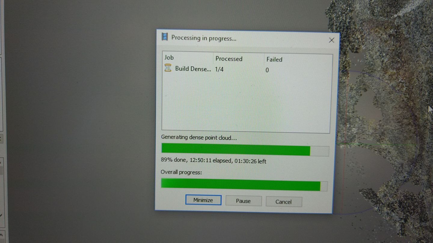
A while ago, Agisoft added GPU support to its wonderful photogrammetry program Photoscan. Calculation speed for the various processes that can make use of it went up a lot. Great!
However, many users complained that generation of the dense clouds suddenly took much longer in the new version. I’ve seen the same thing, and how posted a few images of ridiculously long (and ever increasing) projected calculation times to Facebook. Here’s one:
Given that this was running on my new PC, 14 hours plus was a ridiculous amount of time!
Luckily, Photoscan is getting a new update very soon! Version 1.4.0 is out as a pre-release, and the comments and questions thread on the Agisoft forum site is quite active. People are reporting bugs and asking all kinds of questions – and some of them are not really 1.4.0-specific! And in one comment, the slooo.oo.oooo…….oooowww dense cloud generation popped up, too – and was answered!
“In the version 1.3.0 the number of pairs for the depth filtering has a strict threshold: 50 pairs, in the later updates the limit has been removed.”
Aaaah!
Well, the user asked the next logical question:
“It’s there a way to adjust the limit on the newer versions?”
and got this answer:
EDIT Nov 5, 2018: new version of Photoscan have made the below fix unnecessary, by adding the option that needs changing to the Preferences! See HERE on how to edit the settings, now also available in Photoscan Standard.
A huge THANK YOU to reader Thomas Van Damme, who pointed this change out in a comment below!
Here instead of N you need to input some integer value, for example, 80. Hopefully, it would reduce the processing time considerably without any visible issues. I do not recommend to go under 50-60 pairs, though. To return the value to the default (unlimited) value, please use “-1”:
Exchange the N for a suitable number and press RETURN – I have been using 80 for N and my dinosaur bones look good!
Unless you make a typo, you’ll simply see an empty line and a new prompt. GO run your dense cloud now 🙂
In my tests, calculation time dropped dramatically, and I saw no ill effects on the dense cloud.
🙂 Are you now happy? I sure am…..
In the first post of this series I gave a short introduction to the town of Haarlem (NL), because although it is not very dinosaurian or otherwise palaeontological, and thus should not get a post of its own, it does play an important role for the experience of visiting Teylers Museum. This post I’ll show you the museum building inside and out, and tell you a bit of its history. In the first post, the museum’s front showed up already, and now let’s start this post with a closer look at it.
Quite a grandiose facade, and (to be perfectly honest) a bit overdone in my opinion. Part of that is the lighting, but even in daytime it looks rather like someone planned the entrance to a huge palace, then had to downsize it to 50% size and cut the wings due to monetary constraints, but kept the design.
To the right of that huge entrance door there is a sign – now outdated – giving the opening hours. The summer hours are nothing spectacular. Off the top of my head (I am an idiot and did not take a picture), the museum used to be open from 10 a.m. to 6 p.m. or so. Things differed in winter. In October and March it was open 10 to 5, in November and February from 10:30 to 4:30, and in December and January it was open from 11 to 4. For a very simple reason: there was no artificial light in the building! Once it started to get dark outside, the museum interior went dark as well.
Today, things have changed a bit, mostly with the addition of a new wing with modern comforts, but also with the installation of emergency lights in the old rooms, plus a few additional lights. Still, in the late afternoon in winter you do not stand much of a chance of seeing the fossil halls too well.
Which brings us to the most important point, the thing that makes Teylers Museum so special: it hasn’t changed (much) for over 100 years! It is not only a museum of art, palaeontology, scientific instruments and many other things, it is also a museum of museums! In fact, it preserves a state of museum exhibit design from long ago so well that it managed to get audited when the museum foundation applied for World Heritage status. Now, museums are explicitly excluded, they can never be world heritage – and still Teylers Museum almost got in! Not as a museum of art, scientific instruments etc., but as a museum from ca. 1890! Let me show you…..
First, here’s a bit of history about the museum. It was established in 1778. A rich cloth merchant and banker named Pieter Teyler decided that his money should be used to do good after his death. Thus, he bequeathed his fortune to the city for the creation of foundations for the advancement of art, religion and science. Two foundations were established, one theological and one for all the rest, so to speak. Lumping poetry and physics pretty much fits the age, though, when researchers were often gentleman scientists interested in all of nature.
The first directors of the foundation of science decided to do what Pieter Teyler really had not wanted: they established a museum in his name. To be fair, however, it was supposed to be a study center that offered access to collections and library under one roof, while also serving for educational purposes. Pretty close the today’s concept of a research museum in the vein of AHMN and MfN Berlin, I must say.
Initially, the museum consisted of Teyler’s house. A pretty unassuming place, with a regular door with a small flap at eye level. Visitors had to apply for admission, and when thy got to the museum they had to hand their recommendation letters through that flap and then wait…… and wait…… until, if they were lucky, the door would open.
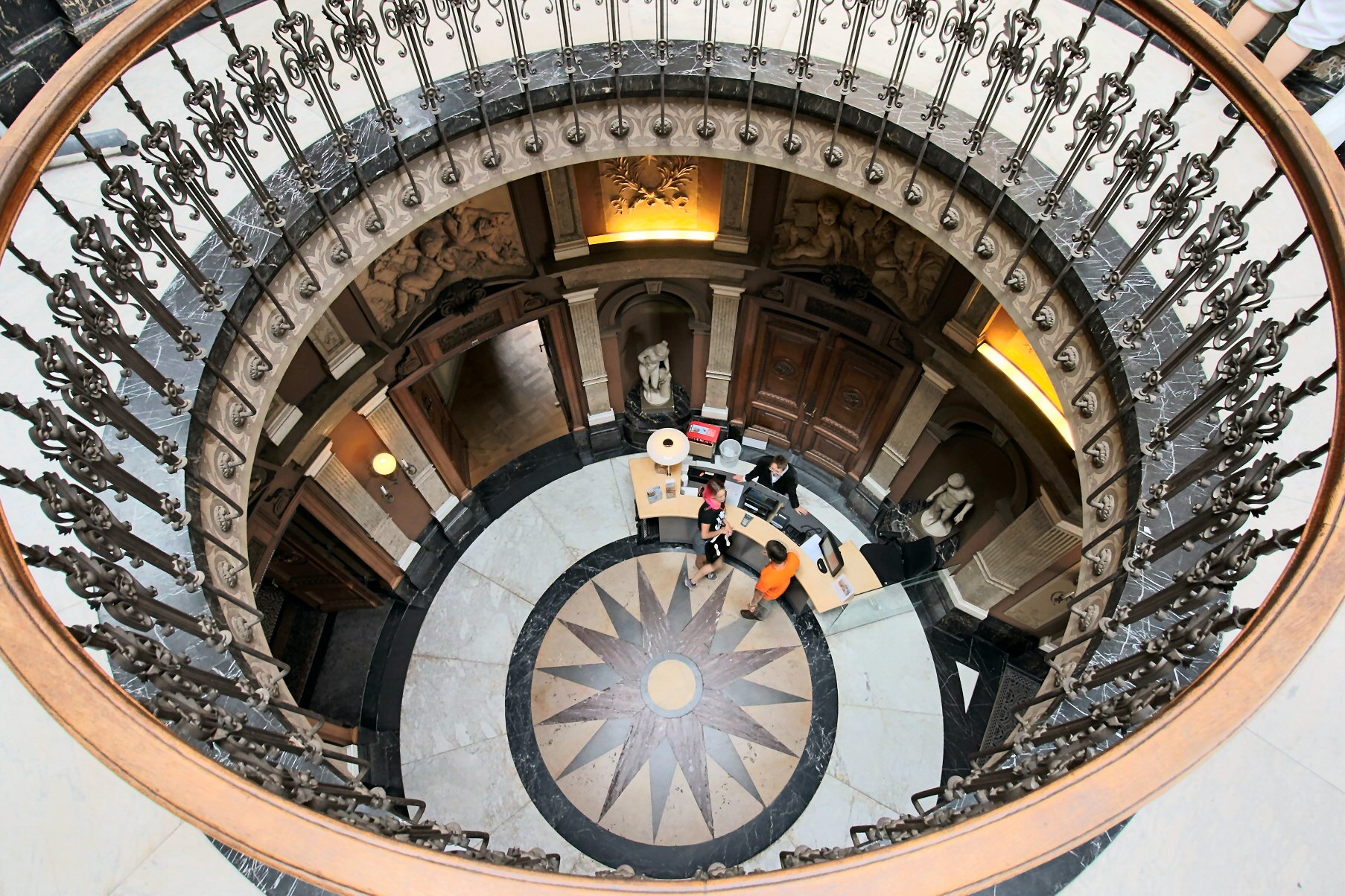
I won’t try to detail the museum’s history here – in fact, a lot of info can be found on its wikipedia page. Suffice to say here that collections sprouted up based on the research interest of the curators – whoever happened to be curator collected what happened to interest him. Thus, the museum ended up with an eclectic collection: fossils, minerals, scientific instruments, models of windmills, coins, paintings, whatnot. And obviously, the museum quickly became too small. A large expansion was constructed, and the architecture is rather impressive (although partly overdone). The entrance rotunda sets the tone, with lots of pillars and columns and marble and statues and reliefs and a gold-painted ceiling – even more opulent than the outside.
That entrance hall is really an amazing sight! It is not really huge, as you can see in the picture below, which has people for scale. But it is also not cramped with some 10 to 20 people in it (except when they are retirees – 3 of them make every place an obstacle course). It is opulent, a marvelous display of craftsmanship, a masterpiece of light and shadows! And – evidently owed to the constraints imposed by neighboring buildings, but you won’t notice that when inside – it is highly asymmetrical! The main axis takes a quite significant turn inside, but it doesn’t feel that way!
See, the rosetta’s dark grey arrow points at the next hall, Fossil Hall I – but the entrance lines up with the red marble arrow down left! However, unless you stand still and deliberately check angles, you will be distracted by the skylight and the exquisite detail throughout the room. And not just here: Throughout the museum, the decoration detail is amazing! Almost everything is carved out of wood, to the tiniest detail! The design varies, but each and very room is decorated to the fare-thee-well, to the point where you can spend an entire visit ignoring the exhibition and focusing on the rooms alone.
Yes, wood. Not marble. Wood!
OK, back to the tour…… From the entrance rotunda, one can either access the museum shop in a modern extension, or go straight into the first of the two fossil halls. Fossils…… yeah, let’s go there 🙂
ah, no, sorry!
Need to point this out again: this is carved wood! WOOD!!!!!!
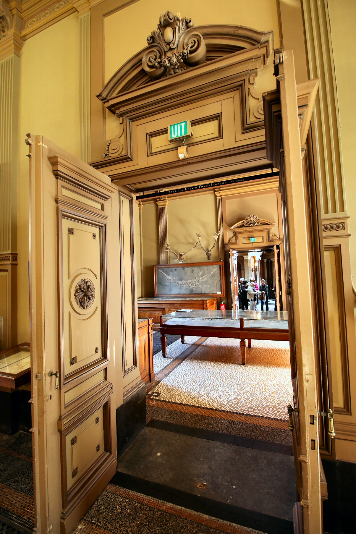
OK, now for Fossil Hall I, here seen from the “back”, through the door of the hall behind it:
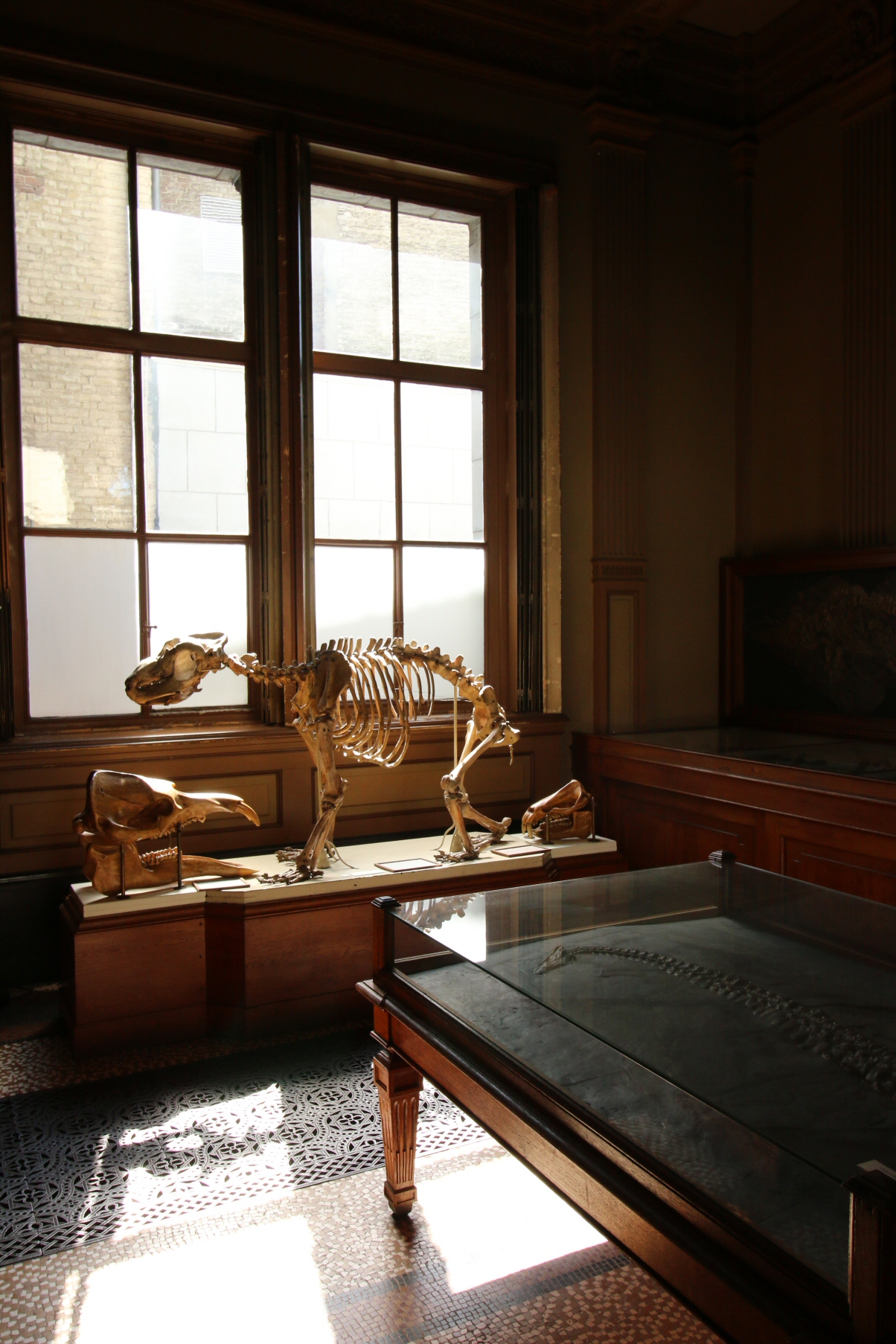
This is the first of two fossil halls, and although it is a small room, what a wonderful hodge-podge of everything one can find in Europe does it contain! Right when you walk in you have to walk around a large plesiosaur mounted as if it was a coffee table – smack in the middle of the room and rather low down. Only a glass cover makes it high enough that most people avoid bumping into it, it seems. If you turn to your left to walk around it, you face this cave bear:
It just sits there, unprotected by any glass or whatever, a reminder of the old times when museum visitors were (at least expected to) behave with respect and decorum. Although…… in Bonn, the Goldfuß Museum has a copy of the old visiting rules on show, and they include such gems as “sabres must be placed in the bin at the entrance” and “unruly behaviour and noise are strictly forbidden.” So much for “decorum”.
A characteristic of Teylers Museum very endearing to me is the lack of artificial light throughout this part of the museum. Used to spotlights picking out the key specimens (or parts) of exhibits and all the rest in the (semi-)dark (with only few, usually historical museum buildings defying this rule), I must say it is refreshing to come into a room where I am not subconsciously told where to look – and where not – by some designer’s concept of illumination! Specimens’ placement is dictated by construction necessities – walls for hanging specimens, doors for not placing them, windows to give light as well as possible. This makes for a very calm and neutral atmosphere in the rooms.
Combined with the exquisite detail of just about everything in the room (note the metal grates covering the heating pipes in the floor!), the lack of electric lights can really make you feel like a ca. 1890’s visitor! It has the effect of making all exhibits pieces somewhat equally weighted, a stark contrast to the weighing modern lighting brings to exhibits.
The first fossil hall is followed by – well, duh! – the second fossil hall………
Uh, no – sorry! Need to come back to the entrance rotunda once more, because it is so awesome:
OK, now that I have calmed down, let’s get back on track for the Tweede Fossielenzaal (God, I LOVE Dutch – to me, as a native German, Dutch will always sound and read like some sort of semi-comical baby German [blush] I guess the same is true vice versa!).
a long table with glass cover and cabinets below down the middle, and large glass-and-drawers cabinets set perpendicularly between windows – how much more gentleman-scientist can you get?
and check out the floors, the metal grates covering the space for pipes…… and the decor of the cabinets, the glass dome covers for the mineral specimens……. The first time I came into this room I noticed a sign pointing out an important whale skull specimen Cuvier himself worked on. On that glass table you can see in the last picture. But where – WHERE???? was the specimen?
Oh, there! ON the floor below the table! 🙂 The floor!
The entire place is cramped, cluttered, there is barely any order to the placement of specimens. And there are stories upon stories about the place, the specimens, the researchers…… the most famous of which is certainly (and obviously) the one about John Ostrom and the Archaeopteryx. A story that is wonderfully told here, so I won’t repeat it here. Go read it! It is a much better and more informative read than my ramblings.
After the second fossil hall, there is the hall of scientific instruments. There is way too much to tell about it and its content, so just go and see it all for yourself! There used to be a lot of info on the museum’s webpage, but they have revamped it into one of those annoying tablet-conformal abominations, and I refuse to peruse it. Thus, I can’t tell you if all the detailed info on the various apparatus is still there.
After the instrument hall, you pass a tiny cubicle on the left that has magician’s tools from 200 years ago and the entrance to the numismatic hall, and then you finally get into the inner sanctum: the oval room!
It is a multipurpose room, exhibiting scientific tools and models of windmills and minerals and lots of other things on the ground floor, and housing part of the library and granting access to the rest of it on the mezzanine level (sadly closed to visitors these days). And the room is a sight worth seeing in itself: with its big windows, the slanting floor (it feels a bit like a ship’s cabin), the exquisite woodwork! With all the warm wood and its modest size, it is a cozy room, but at the same time it has a certain air of grandeur. And it has that grand white-and-windows ceiling that makes the ceiling shine like the sun 🙂
and on that high note, I will end this post. There are plenty more rooms, but I actually won’t mention the halls dedicated to art (Dutch masters, mostly), nor the modern annex. The oval hall is the pinnacle of museum architecture from 150 years ago, it is the fitting end to this description of the museum building. Next up will be a rather haphazard overview of some of the exhibits, before (finally) EAVP 2016 is on.
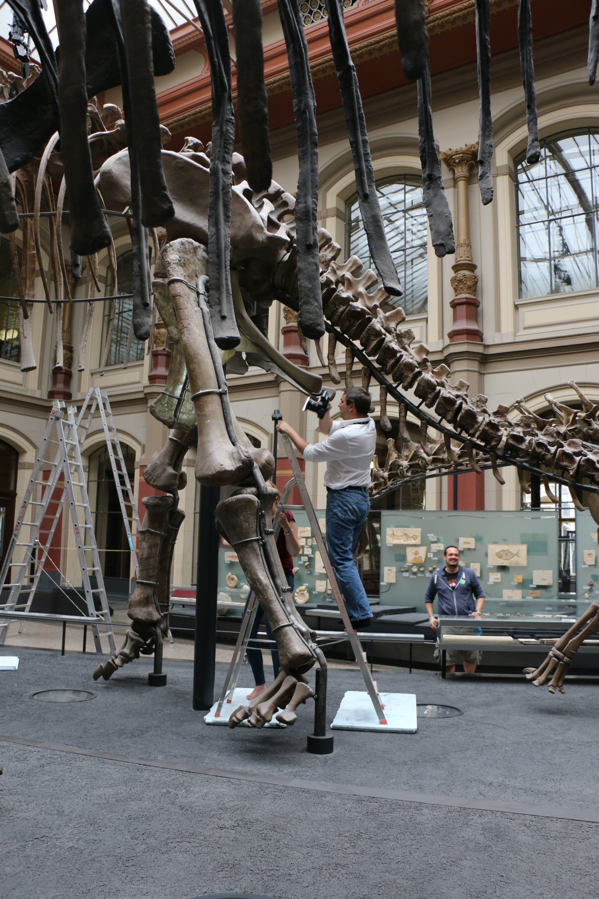
Quite a while ago I mentioned that for fiscal year 2016 I again received funding from the Berlin digiS program. Whereas 2015 saw Bone Cellar material digitized, the linked post shows one of the the first results of the 2016 effort, which concerned the mounted skeletons in the MfN Berlin. And obviously, the elephant in the room – erhm, the biggest sauropod in the room! – is Giraffatitan!
The aim of the digiS-funded program was to obtain high-resolution 3D models of the mounts’ bones, not just of each bone individually, but also of their spatial relation. Which allows creation of a high-resolution complete model of each mount as it exists in the exhibition, but also allows for correction of the virtual mounts. Real mounts are suboptimal, because they need to contain armatures to hold the bones, and these get in the way of a perfect mount. And they may have errors simply because of human error, or because of deformed fossils, and whatnot.
Initially, as shown for the Kentrosaurus mount in the post linked above, I had planned to create overview models at low resolution, as well as detailed models of individual bones, or small groups of bones. The latter were then to be inserted into the overview models, aligned perfectly, and exported again. Thus, they would be aligned perfectly with each other, but there would be no need to load them all at the same time. That’s an important point, because 3D data gets awefully big awfully quickly, and that means computer crashes. Obviously, one can always downscale data, but with an animal that has some 300 bones and each bone resolved to only ca. 1 mm, that’s still talking gigabytes of data.
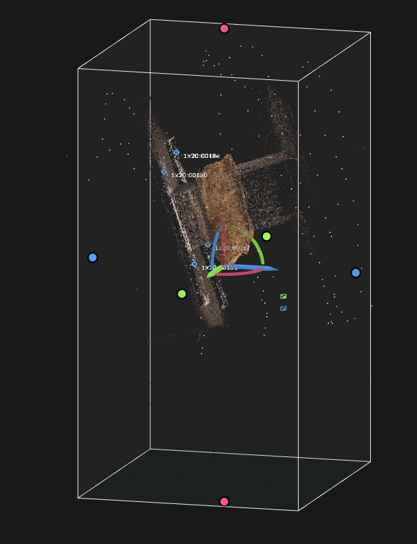
In the end, things partly worked this way, and partly worked differently. Here’s how things went down with Giraffatitan!
Yep, that’s the entire sauropod group in ONE model! This is the sparse point cloud, i.e.: the points used to align the images. Each small white point is one camera position. In preview quality there are a few more points, and Giraffatitan looks like this:
Not too shabby, I say!
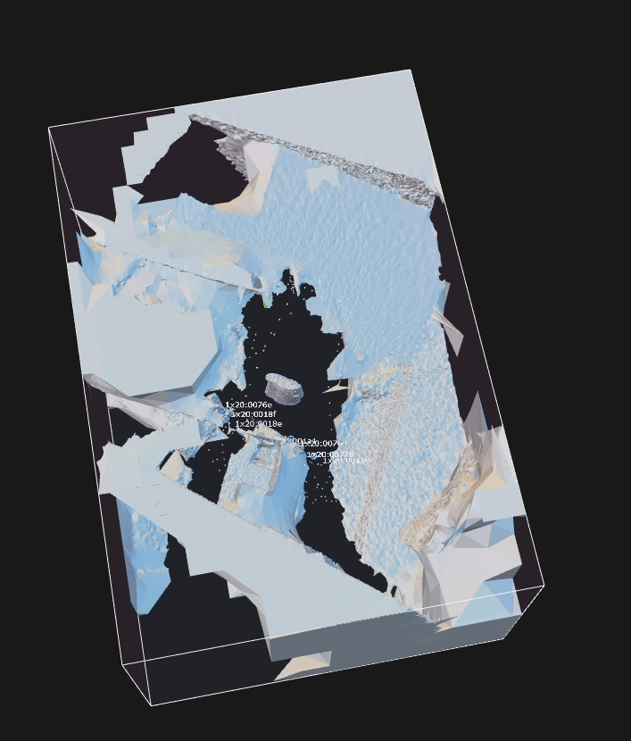
Now for a high resolution…..
Thank you very much, this will do!
In fact, it does extremely well, as can be seen in a closer view! This model, which as an entirety shows all the sauropod mounts good enough for “overview quality” shows individual bones at a sufficient resolution to serve as a “detail” model! Photogrammetry has come a long way since the day I planned this project 🙂
What you see above is really three integrated data sets, the biggest of which is again a lumping of several sub-sets:
- overview images that show the entire mount
and
- close-up shots of the ribcage, shoulder girdle and hips,
  which are in fact
     close-up sets of
             - the shoulder girdle
             - the anterior ribs
             - the medial ribs
             - the posterior ribs
             - the ventral sides of the vertebrae
             - the dorsal sides of the vertebrae
             - the hip
             - the tail base
and
- overview images of the entire animal and the neck, shoulder girdle and back taken from a hydraulic lift.
In fact, when we took the photos we sub-divided them even more, although it proved to be difficult to stay consistent when working high up on a ladder in a sauropod ribcage. Especially because the ladder couldn’t be placed on the ground normally, but had to be set on hard foam plates to cushion it, as the special floor cover under the sauropods is easily damaged. So it all felt a bit like a high wire act, surrounded by fragile and irreplaceable fossils *gulp*
Here’s a shot of me sticking my camera up Giraffatitan‘s butt [the things we do for science *sigh* – if this was a life animal I might have gotten my face full of dung or egg] that shows the foam pads nicely.
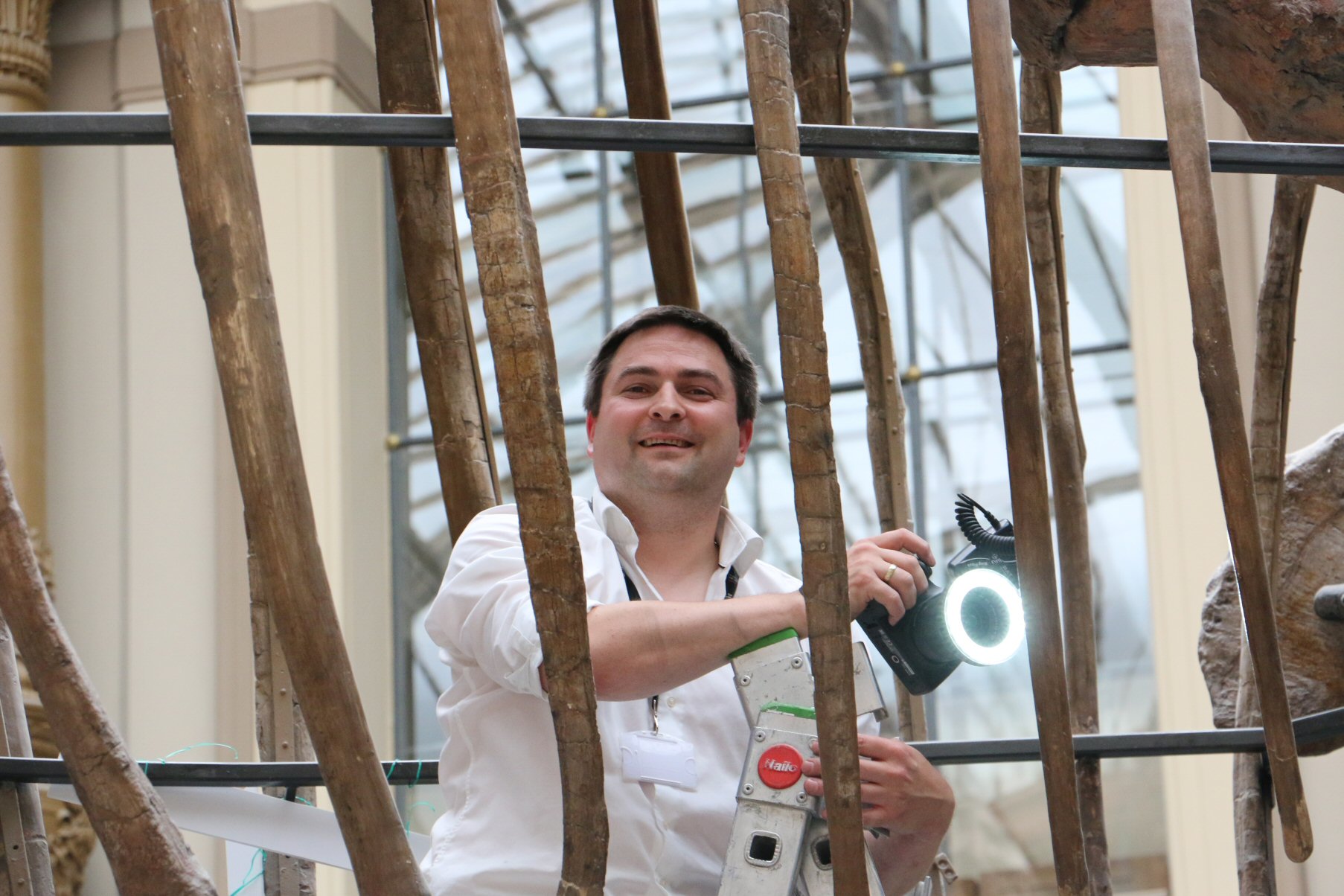
We did two shots the first time around. One during the day, with natural light (you can see the shadows under the feet of the skeleton), during which my partner in crime Matteo Belvedere and I took turns.
Photographing the inside of the rib cage is a special challenge, as it is hard to put the camera on a tripod (which had worked well before for the overview images of Dicraeosaurus– images to come). First of all, you need one hell of a big tripod, then it has to be set on foam mats, too, and the ribs and the lamps in the floor and the feet and the hips… make it hard to put the tripod in all the locations you need it. Also, while a tripod allows long exposures, so that having sufficient light is not an issue, it doesn’t help with getting the recesses, nooks and crannies of the skeleton light properly. And dark recesses lead to holes in photogrammetric models, and that is the last thing we wanted. Thus, as I always do if I can, we used a ring light (a ring flash also does the job), as it gives lens-parallel light. This means that the images have no shadows on them, and that recesses are well lit. Personally, I prefer a LED ring light to a proper flash (but some of my colleagues vehemently argue for a proper flash), because it is not that heavy, and gives out a constant light. This makes it easier to shoot rapidly and without worrying about the exposure, as I can can use the auto-exposure mode of my camera. The drawback is that the amount of light it gives out is fairly low, so that I need to get close to the object I photograph. Which isn’t a problem when I want to create a high-resolution model, as I need to get close anyways to achieve sufficient resolution.
Still, this means hand-holding a hefty DSLR with lens and the ring light at arm’s length for hours at a time, which can be quite exhausting. Doesn’t take the fun out of the project, though.
Now, it wasn’t me alone doing the shoot, so Matteo and I could spell each other. But that doesn’t mean that one of us could laze around half the time as he pleased. The rather rickety ladder support meant that most of the “off” time was spent like this:
Booooring! You get to spend hours at a time watching your colleague’s butt sway around a dinosaur 😀
The last photo shows the second, night-time data capture session. You can see that even the dinky LED ringlight gives quite a splash of light on the skeleton! This shot was at the height of a summer heat wave in Germany, and despite only wearing shorts and T I was sweating profusely, to the point where holding the camera was a challenge because my hands were so slippery. Also, I had to wipe my brow all the time to keep sweat from trickling down into my eyes. High time the Museum für Naturkunde gets air conditioning – not just for comfort, but to protect the exhibit specimens!
So, did it all work out smoothly? Far from it! This project was a major pain in the rear end, simply because of the complexity of the capture process and the humongous amount of raw data we had to handle. Also, the mounted bones proved a bigger challenge in many respects that I had hoped. For example, many bones reconstructed badly because they are partly hidden from view by other bones. We can see a lot of their surfaces that a photogrammetric model cannot capture too well, because we can peer into deep recesses, but it is difficult or even impossible to get several photos of the surfaces in the recess at not-too-shallow angles. Think, for example, of the acetabulum and the femur head in it. We can easily look into the gap, but despite trying really hard my models would only show about half of the femur head surface in acceptable quality.
Additionally, for really high resolution models it is important to capture the surface at high resolution, which means taking a lot of images with small offsets and angles between camera positions. Now comes another bone, one that articulates with the one I am digitizing, and hides a big chunk of it – say, worth a 20° angle. My chance of photos of one part and those on the other on the other side of the obnoxious interfering bone aligning well is not too great. In fact, this turned out to be a major issue! Obviously, I can just digitize the two bones together – but then we are talking project with some 2000 to 3000 images in one model! EEK!!!! Calculation times of several hundreds of hours are a major drain, but if that’s for uncertain gain…….. I tried a different, much faster software, Reality Capture (from which is the Giraffatitan model above), but it has its ow issues. Among them it demands very small angles between images, which makes the issue of one bone hiding part of another even more of a problem.
And as if that wasn’t enough to deal with, the mounted bones all have been treated lavishly with a wide variety of glues and lacquers (remember, most were originally prepared a century ago!), making them quite shiny. Baaaaad for photogrammery! And their upper sides are all rather dusty, which – like shininess – induces a color change depending on te angle you photograph them. UGH!
Thus, a lot of models failed or at least didn’t work as well as I had hoped. With the new, GPU-supporting version of Agisoft Photoscan out now, and the MfN IT wizard having re-shuffled a lot of the CPU and RAM and GPU at his disposal, I will run a bunch of model again and expect to get good results. But…. it’s been a bother.
Anyways, overall this was and (contra planning) still is a fun project, made possible (I should mention again) not by some palaeontology-related grant, or by the MfN’s (already overstretched) budget, but by the state of Berlin funding digitizing initiatives with the explicit aim of making assets accessible. So do expect our scans to go online at some time, hopefully soon!
After all the recent photogrammetry posts it is high time to get away from “stuff that somehow has to do with dinosaurs a little bit” and finally write again about dinosaurs themselves. Which is why I now will write about something that has nothing much to do with dinosaurs at all: 2016’s EAVP (European Association of Vertebrate Palaeontologists) conference, which took place in the wonderful Teylers Museum in the wonderful town of Haarlem (wikipedia). But fear not – dinosaurs will feature in a post later this week 😉
The trip to EAVP 2016 wasn’t my first visit to Haarlem. I went there a few years ago when I applied for a job at Teylers Museum. A job I didn’t get, in the end. Back then I was quite disappointed, because it would have been a very cool job to do in some regards – you’ll see why, when I get around to describing the museum. On the other hand, it would have meant some pretty radical changes to my family’s plans and a pay cut. In the end, I guess I would have been happy there, but I am also happy where I am now.
When I went to Haarlem the first time, for the job interview, it was February, and grey cold weather. I arrived in the early evening, by train, and walked to my hotel – and already I had fallen in love with the city! It is very much cliché: canals, small brick houses built wall-to-wall, cobblestone roads in the city center. And a windmill! Which I promptly photographed the next morning.
Here are some more views of the town, both during the day and in the evening. I am posting them here, although they have no relevance whatsoever to dinosaurs or palaeontology, because the town has quite a relevance for the way a visitor will experience Teylers Museum: the museum is special due to its history and the state it is preserved in (intentional choice of words here), and it fits into the town in a way other museum of natural history don’t. So bear with me, get to know Haarlem a bit.
Lots of small shops, cafés, and most certainly a huge number of bicycles! Well, it’s Holland, so what should one expect? This road is obviously one of the more picturesque ones, but there are plenty of them in the old downtown of Haarlem. It is an old town, having gained city rights in 1245 A.D., which doesn’t make it very old compared to many other places in Western Europe, but does mean – given the lack of WWII carpet bombing and other devastation – that it has an old, grown city center.
Haarlem is – what a surprise! – full of canals. On the smaller canals – wait one, let’s clear up terminology first: a canal is called a gracht in Dutch if there are roads on both sides and it is in a town, a singel if it is or used to be a moat surrounding a city, even it the city has grown to include it and it now looks like a gracht, a kanaal if it is in the countryside and mostly for drainage, or a vaart if it is in the countryside and mainly a transportation route. This out of the way, let me say that there are a lot of small boats, but also sometimes bigger ones that, for example, which for example may serve as flower shops.
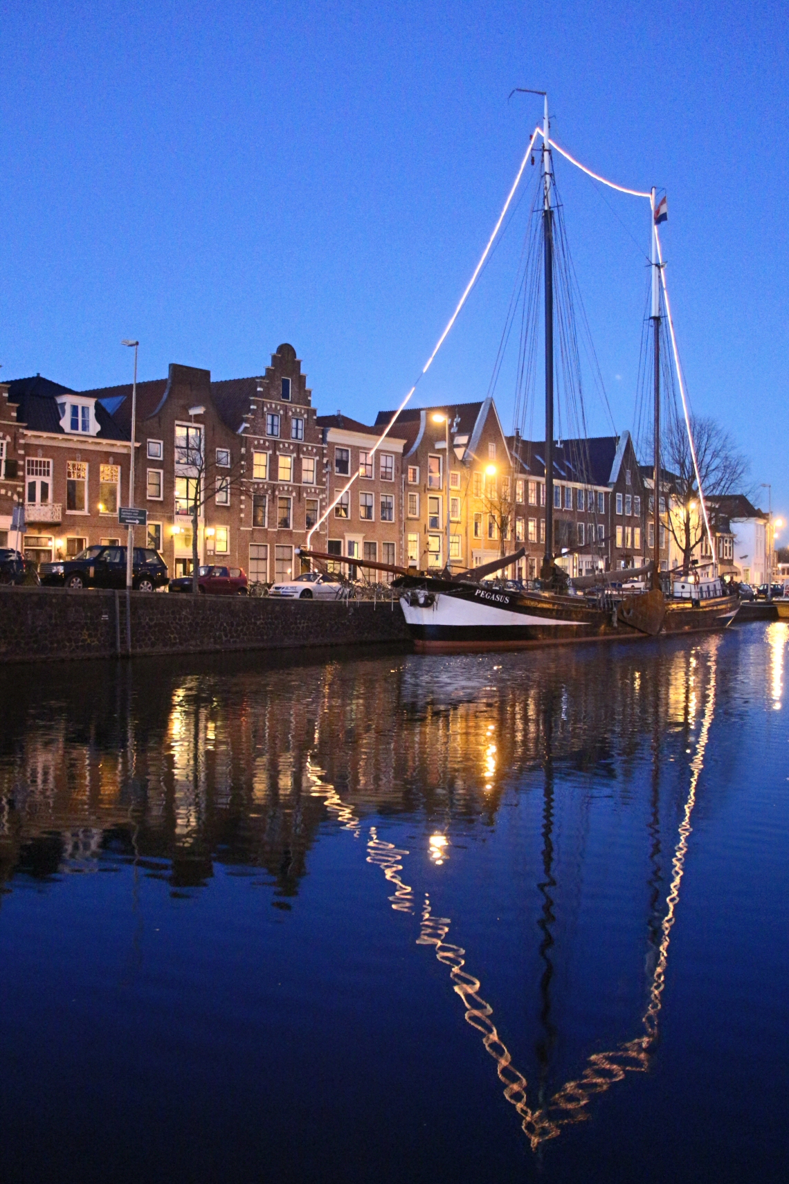
The big river of Haarlem, the Spaarne, which runs right past hte city center and has quite a lot of ship traffic going on, is virtually indistinguishable from any other gracht but for its width and runs by Teylers Museum, with its quite overboardingly decorated facade.
Here’s a closer view.
But I am getting ahead of myself, as I wanted to show you the town before I show you the museum building, which then is to be followed by the museum’s content. And then soem words on the EAVP meeting. So, here’s another view of that windmill, this time with the sun out:
Also, some views of the city hall and the Grote Kerk St. Bavo (“Great church”, i.e. cathedral), which both (and a bunch of nice restaurants) are located on Grote Markt (I guess there is no need to translate this name).
The Grote Markt is still being used as a market square, Monday and Saturday, and has not only a large number of stalls selling all kinds of things, but also a bunch of theropod ne’er-do-wells hanging around.
All this sounds quite quaint, and there is much more to like about Haarlem that makes it appear more like a country village than a bustling town. For example, although most roads are narrow and the sidewalks narrow, with little to no room for anything green, there are still a lot of flowers in view as soon as you leave the (indeed bustling) shopping streets of downtown, and walk into the residential areas of the owl town. Aside from balcony flower boxes, quite a lot of houses have Alceas (wikipedia) growing in front, not in flower beds or pots, but simply between the pavement stones.
Compared to Germany, a lot of Haarlem looks very British to me, considering the bricks, doorframes styles, window styles, door styles and so on, but the huge Alceas combined with the plethora of bikes somehow dispel that notion and make the place distinctly un-British.
Many shops in the city enter are still small and non-chain, and have individual signs hanging out in front.
And, obviously, a lot of grachts mean a lot of bridges. Many of these are drawbridges that will be pulled up for larger ships, and quite many are pedestrian/bike only. Overall, the narrow streets and the no-car bridges make Haarlem a very nice town to walk in.
Now let me close up this post with a few sunny daytime views, both of the Grote Kerk, seen from a nice restaurant we had lunch at during the conference, and of Teylers Museum seen from across the Spaarne river
Enough for today! It is time I introduce you to Teylers Museum and a few bits about its history in the next post.
Photogrammetry is a really nice and easy way of surface digitizing specimens in collections, but also useful in the field. Recently, Marie Attard, a colleague working in England, asked me to help with a project that deals with rock surface shapes. I don’t want to say too much, but this I can tell: she wants to capture rock surfaces on cliff on which birds lay eggs. Obviously, in this case, it is not only of interest what the surface shape is, but also what the surfaces tilt is in the field: is it level, or does it tilt toward the cliff edge or toward the cliff wall? And while you can simply use a geological compass to measure this, write the info down and be done with it, wouldn’t it be nice if the same info is also included in your 3D file?
If you follow the tutorials I previously posted here, you’ll be using long scale bars placed around and maybe even on your specimen for scaling. These scale bars will usually rest on the ground or table under your specimen more or less horizontally, but they are not useful for “leveling” your model. Well, they kinda are, and there is a neat trick for how you can make a model come out right-side-up (roughly), but that’s not good enough for the bird nesting site thingy.
So, Marie and I thought about this a bit, and soon came up with an elegant solution, one that actually does a bit more than we aimed for! Here’s how you
Preserve strike and dip of a surface in a Photoscan model
First of all, you best use a special kind of scale bar. It should be L-shaped, and for convenient in-program marker placement in Agisoft Photoscan it should have three of the automatically recognizable markers printed on the ends of the two arms of the L and at their meeting, with the distances between them known exactly. Here’s how they can look (screenshot of print file created by Marie Attard)
(As you can see, Marie ingeniously also added a label at one edge saying “cliff edge”. In the field, you simply align that side of the scale bar with the cliff edge and already you have preserved the information of the cliff edge’s strike in your model. This means that you can’t preserve the geographic direction using the same scale, though. You then need two scales)
So how do you use such scale bars to preserve strike and dip of a surface? First, you place one scale bar flat on the surface. Then, you put a compass on it, aligned with the edge of the scale bar, and rotate the entire thing until the edge points due North. Now, you level the scale bar. If you use a geological compass, or any other that has a round precision bubble level, you can use that. However, I personally find it easier to use a tool that you can buy cheaply for e.g. caravans: two combined bubble levels.
Putting this on the scale bar you now need to level it by shoving tiny pieces of cardboard or so under it. That can be a bit of a bother, and Marie came up with some ingenious solution: she bought a mini tripod on which she mounts the scale bar. Either way – once the scale bar is level, you start taking your photos of the surface as you normally would. If you wish to preserve some other information, e.g. the cliff edge direction mentioned above, you can use a second scale bar aligned with it.
Then, once you have taken the photos you need for scaling the mode, you remove the scale bars and proceed to take your photos for model creation – otherwise your 3D model will have the scale bars in it.
And all the rest is done in Photoscan!
Align your photos normally, including the scaling images. Remember to make them inactive afterwards, so that they do not contribute to the dense point cloud and thus the 3D model. Now, let Photoscan detect markers, or manually place the markers on the scale bars on your images. Make sure, if you do this manually, to name the in-program markers so that you recognize them properly.
Now, create your scale bars in Photoscan, scale the model – all as you would always do it.
Finally, go the the “markers” section of the reference pane. Here, you will find all your markers, and here you can set world coordinates for them. The marker at the meeting point of the two scale bars that form the L gets the coordinates 0,0,0, the two others get the same plus the respective length of the scale bars added to the X for one and the Y for the other. Click UPDATE and voila, your model is level!
Obviously, you can preserve any direction in the field by placing a scale bar edge along it. It need not be due North, it can also be a cliff edge, or whatever.
It has become a bit of a tradition that I use this blog to make Mike Taylor of SV-POW! (and much other) fame a tiny bit jealous. By posting photos of the Museum für Naturkunde Berlin dinosaurs, for example a selfie with the skull of the Giraffatitan mount, or from other unusual perspectives – photos a normal visitor can’t ever take, and photos Mike (despite getting better access as a researcher) didn’t take during his short Berlin visits. His real-life job has given him far too little time to come visit. Still, the MfN Berlin dinosaurs have featured prominently on SV-POW! again and again. In fact a very special bone, the 8th cervical of Giraffatitan individual SII featured in the very first post there.
Mike, aside from being a very esteemed colleague in the same league as Eric Snively, Larry Witmer, Matt Wedel, Andy Farke, “Dino” Frey, Aki Watanabe, Michael Pittman, John Hutchinson, Viv Allen, ….. oh, jeez, I better stop before this becomes a ten page list of cool people in paleo!
Anyways, Mike is not “only” a really cool colleague and (American-style) friend, but also someone I personally trust in the way Germans trust their friends (which is on a totally different level than a US-style friend).
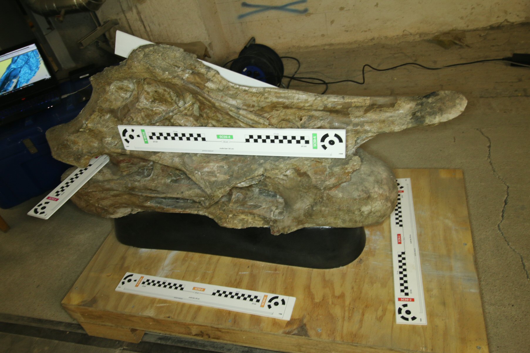
Given the affinity of Mike for the Giraffatitan‘s 8th cervical it is, I guess, especially suitable for making Mike all green-eyed. After all, while it was on display in 2005, today it has a new number (MB.R.2181.47 or MB_R_2181_47 in the computer-palatable version), rests in a wooden box in the bone cellar, inaccessible and hidden from view, and gathers dust – except for Wednesday two months ago. On that Wednesday, it was moved out by the MfN preparators to the hallway, and the sides of the wooden box were taken off, and the sand bags that stabilize the vert were taken away. For this:
3D SCANNING!
Artist Alicja Kwade wanted high resolution scans of various bones, and for this very special occasion the museum OKed access. Alicja payed for the scanning of several vertebrae and ammonites by a professional surveying firm, matthiasgrote PLANUNGSBURO. Now, a lot of people have told me that they know some firm or other, and that said firm will quickly create perfect scans. A lot of people simply buy an expensive scanner, know roughly how to handle the software that comes with it, and them call themselves “experts”. Well, typically I have these conceited scanning “expert” for breakfast…… but not these guys! I was very impressed by their knowledge and experience. They know exactly what they are doing, know how to work to order (e.g., not creating a model at far too high a resolution, which means unnecessary cost), can do top-notch models if needed, brought a wide range of tools, all of which they knew exactly how to employ – it was great fun and quite informative to see them at work! And both the boss, Mr. Grote, and his two employees are very nice people, with whom I had some fun conversations.
Still, any such opportunity to scan difficult objects is a challenge for me, and this is especially true when someone else is scanning the same object at the same time! Can I scan as fast, as accurate, as detailed as them? Can I predict my data capture time and scan resolution and accuracy accurately? Does my data capture approach work at all? In short, can I hack it? I have recently become pretty cocky, given the success of the digiS bone cellar project‘s success, but that concerned rather simple bone shapes. This time, as I quickly saw, I was pitted against the elite of 3D scanning, and the specimens were of an entirely different level of complexity. Not that I expected the experts to beat the resolution of the model I was going to try and make with the scan they needed to do for Alicja – theirs would be for rapid prototyping on a CNC milling machine, and therefore of limited resolution, whereas mine would be aimed at way-more-then-enough for all science and exhibition uses I can currently imagine. But, knowing how scanning people tick, I was expecting them to additionally go for a top-notch scan anyways, going way beyond the ordered level of detail and resolution. And given the tools they brought and their expertise, I must admit that I was a bit afraid of working too quickly, taking too few photos and ending up with a model that has errors or big gaps, and compared badly to theirs.
In the end, as the photo above shows, along with an Artec Spider scanner they did bring the Big Gun – the Faro ScanArm with laser scanner. And they did go for a very high resolution and high accuracy scan. Which means that my best scan would have to measure up to a really excellent scans by them……. *gulp* I was quite a bit tempted to forego my usual happy-go-lucky high-speed scanning routine for a calmer, more thorough approach, maybe even using a tripod, simply to make sure that I drive quality up as high as I can. But then, the comparison is only fair if I stick to the same effort expended and use the same tools that I normally do!
So, they scanned with the Faro Scanarm and an Artec Spider scanner, and I used my trusty old Canon EOS 70D with a cheap LED ringlight. No tripod, no extended scan planning. Just my usual happy-go-lucky approach. Several vertebrae were set out on the work table in the Bone Cellar – not much room to work in, but sufficient for the artec scanner and my camera. The huge cervical 8 of Giraffatitan was moved to the hallway outside the bone cellar to allow better access with the Faro scanner, as can be seen in the photo above. And there it was that I went at it with my camera.
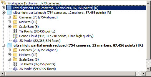
Overall, I took 754 images, the first 20 with scale bars placed all around the bone, the rest overview and close up photos without scale bars. Here’s one of the former:
The scale bars use the pre-made markers that come with Photoscan, so that the software can automatically detect them. This time it worked like a charm, saving me quite a bit of time. Matteo Belvedere is to be thanked for fighting with Photoshop to create the file from which we had the scales printed – thank you very much, Matteo! I used a bunch of 0.5 m scales, because scales half as long to slightly longer than the specimen you scan are best: they provide the least proportional error without causing extra work capturing them. And I must say that the resulting accuracy is pretty pleasing! Below you can see a screenshot showing the scale bars and their respective errors:
note that the average deviation between the scales, each 500 mm long, is less than 0.33 mm, i.e. less than 1/15th of a percent 😀 Photogrammery FTW!
After taking the scale bar photos I removed the scale bars from the bone. The same process – removing the photos with scale bars – I later repeated in the Photoscan project file, after alignment: I made the images unavailable for model creation. This way, they are there for scaling, but are ignored for construction of the dense point cloud, and do not litter the model. Because of this approach I can place scale bars ON the bone itself, instead of just around it, which gives me more flexibility. In some cases, like digitizing trackways, placing the scales on the specimen you wish to digitize is the only way to place them, so remembering the trick of using them for alignment and scaling but blocking them later is helpful.
The additional 734 photos fall into three distinct categories:
images I took while “rastering” the bone
images where I deliberately pointed the camera into recesses and at other difficult points
overview images
The first category obviously is necessary to deliver a model that shows the entire bone at high resolution. I makes up about 1/3 of the total, because the photos need to overlap quite a bit. The second category makes up more than 1/3, not because I really needed that many (despite the plethora of deep, air-sac-caused depressions in the bone), but because I took way too many images, to make sure that I had enough to cover all the many nooks and crannies. Better having too many photos resulting in extraordinary calculation times than ending up with a model with unnecessary holes! Last but not least, the overview images are necessary to guarantee a good alignment of the other images. Yes, you can omit them, but if you take a series of images down one side of the bone and another up the other side, there is a high risk that your model will “warp” a bit. Overview photos keep this in check.
Rastering is best done by doing one set of photos with the camera pointed at the center of the specimen, then (for complex shapes like verts), another with the camera tilted left by ca. 30°, and another with the camera tilted right at 30°. Or up and down, depending on the shape of your specimen and how you place it. Or all of them – up, down, left, right….. and so on. Here, I made sure I used “straight”, “left” and “right”, as well as “up”. “down” images weren’t needed as a separate set, because of the geometry of the vertebra.
Then came the “recesses” part, which basically means pointing the camera at the midpoint of a hole, then moving it on the surface of an imaginary sphere but keeping it pointed at the same location. I did this for every single freakin’ depression….. *sigh*. I much prefer proper titanosaurs; they relocated their air sacs into the bone and have rather smooth outer bone surfaces. Much easier to digitize!
All in all, I spent 45 minutes and 21 seconds on photography, which does include a short 20 meter walk to a door and back to let some people in, as well as the time required to pick up and toss aside the scale bars. Divided by 754 images this means I took a photo every ~3.6 seconds. That may sound impressive, but it is actually slow work for me. Usually, I just aim the camera by eyeballing the brightness of the ring LED light on the bone. In this case, however, I felt the need for a more thorough approach, and used the 70D’s twistable touch live view screen to aim the camera and select the focus point. Usually, I achieve photo rates of 0.8/s, not .02777/s, but the live view screen makes shutter release slower, and the process of taping the screen each time to select the focus point and trigger the camera also is slower than simple blind point&shoot. Still, if I can’t easily go back and re-shoot a specimen, I’d rather spend more time and make sure I can guarantee a good model.
So, did all this effort give me a model I can be proud of? Can I hold my own against one of the best scanning crews out there? I can’t really judge, because I haven’t seen their models yet, but on the other hand I believe the results speak for themselves:
Yes, you read that correctly: the model has, in the highest resolution possible, some 484 million points in the dense cloud! Meshing a tiny part of it delivers a 80+ million polygon mesh!
This is the full dense point cloud in all its glory! Note the hole at the bottom, where the vertebra rests on a plaster support made to fit. No way was anyone going to lift the vert up so I could take photos of its ventral side. It is way too heavy and fragile! We have very accommodating collections curators and managers at MfN, but lifting this bone is way outside anything they would ever consider – and rightly so!
And a close-up – click for full size:
This area is less than 15 cm wide… oh yes, the resolution is amazing 🙂 Now let me show you the mesh…… below is a total of the dense cloud with a small part I meshed right away superimposed. Note that I did NOT yet clean the dense cloud at this stage, which is why there are ugly black rims on top and so on. The meshed area resulted in >80 million polygons, here decimated to 1 million.
and a zoom-in on the mesh (with slight smoothing):
yes, that hole you see is real! The bone really is that thin 🙂 I put two markers on the two sides of the neural arch that the mesh happened to cut. You can use Photoscan as a measuring tool by simply scaling a model creating markers and a scale bar from them, setting it to length 0, and checking the error – that’s the length of the scale bar (assuming you scaled your model correctly before). The thickness of the bone is really just
~4.569 mm! And despite the enormous size of the specimen, my happy-go-lucky model managed to keep the two sides consistently separate, except for the spot where there is a real-life hole in them, too:
So, overall, I am *very* pleased with my results! I haven’t seen the scans by Grote yet, so I can’ really say how I measure up against them, but I have once again been able to capture a very high detail model of a difficult object with simple, affordable and mobile equipment.
So, Mike, here it is now in all it’s glory – or should I say, in a small percentage of all its glory? As this is only a 74 million polygon model after clean-up, and if I ran this at ultra high resolution I’d expect it to have around 600 million. It is detailed enough, though, as it is….
Here’s a short update on how my digiS 2015 project is coming along. Yes, 2015 is still running, due to a bunch of unforeseen circumstancesa huge theropod sticking its ugly skull into my affairs and demanding to be photogrammetrized in a big hurry. digiS 2016 is also running, which means that I have about 50% of the computing power at hand that I need – ugh! Our IT is doing all they can to keep me happy, which is way more that their jobs dictate they should do, but they can’t work miracles. I am enormously grateful, and really hope that my work makes the higher-ups in the museum realize how excellent the support is IT gives researchers at the museum.
Now, where are we with regards to “Liberation from the Bone Cellar” – a project title not quite as tongue in cheek as it may sound, as the work conditions in the basement are really suboptimal enough to make many research approaches barely feasible that really should be easy in an ideal world.
Well, I am glad to report that things are finally chugging along nicely! Both my computer screen and that of my colleague Bernhard Schurian are usually populated with views like this:
(click to embiggen for readability)
What you see here is a batch process file in Agisoft’s awesome Photoscan Pro. Each batch contains the photos taken of one bone (both top and bottom side), and we run an overnight batch process for photo alignment for all chunks. Then, we optimize the resulting sparse point cloud, scale the models, and run another batch process for dense point cloud calculation. Then, the results must be manually cleaned – after all, we do not want to have all kinds of background data in the files. The screenshot was taken just after cleaning of the dense clouds. As you can see, in this case there are 6 chunks, i.e. 6 bones. The second and third are marked inactive, which means that we had some sort of problem with them. Usually, what gives us trouble are photo sets that do not align perfectly, usually because we run the models with fairly low sample point ratios (max 10.000 per image). Instead of stopping work on the other chunks while we fix these problems, we typically just ignore them, finish the rest of the chunk, and then come back and deal with the problems. Usually, this simply means re-running the alignment with more sample points (40.000 or unlimited).
Each of the six chunks has been aligned, and you can see the number of photos per chunk, the number of resulting points in the sparse cloud, as well as the number of markers we already assigned. In the two chunks that have been expanded you can also see the number of aligned images each: in the first 169 of 175, but in reality 173 as the first two show the label, which equates to an alignment quota of over 95%, and in the second 163 of 165-2=163, a quote of 100%. Considering the free-hand photography at close quarters that we did this is a pleasing result 🙂
You can also see the setting (Medium quality) and resulting number of points of the dense point clouds: over 7 and 9 million points, respectively. That’s way more than 99% of all science uses of the models will ever need, and in fact way more than 99% of all science uses can handle! I expect to get meshes with around 9 to 13 million polygons, and such big files are a bother to load. Mounting a full skeleton, or even just a girdle + limbs, at this resolution will crash most computers!
The key thing we are proud of you can see at the bottom left of the image: the average error between our scale bars. For the “small” bone fragment in the open chunk we used four scale bars, one of which is 20 cm long, and the other three are 25 cm long. The average distance between them in the model, which in an ideal model would be zero, here is 1.3 mm, i.e. slightly over half of a percent of the average scale bar length – and this is one of the worst models we produced (which is why I show you this one). Most have three zeros after the comma, not two! That is an amazing accuracy when you consider the far-from-optimal conditions in the Bone Cellar and the speed with which we acquire the data: I usually take less than 7 minutes per bone including transport!
So, overall, I’d call digiS 2015 an overwhelming success – for us, for paleontology as a whole, and for all our colleagues out there who want to quickly capture a lot of data during collection visits. While our photography method is physically exhausting, the results show that digitizing 10 to 20 big bones per day in collections is entirely feasible.
I rarely take selfies. Mostly because I hate being photographed, but also because I do not see the need to show everyone in the world everything I do. Here’s one, though, that I just had to take, mostly in order to get Mike Taylor to swear at me 😉
I took this while working on my 2016 digiS project, when I was busy getting close-up shots of the neck vertebrae of the Giraffatitan mount. They are fiberglass, because the original bones could not be mounted. I still need a fairly god scan of them, so that once we scan the original bones in detail we can put the high-res scans into the place they should have on the 3D model of the mount.
Last year I received funding to digitize a lot of big bones of the Tendaguru collection from the Museum für Naturkunde’s Bone Cellar. This year, I was lucky to again secure funding from the digiS programme. This time, it’s for digitizing the mounted skeletons in the Dinosaur Hall, the mounts my esteemed colleagues M&M (Matt and Mike) called “a shedload of awesome“. The reasons are fairly straightforward and simple: due to digiS 2015 we now have better digital access to the individual single bones from Tendaguru than to the partial skeletons of better preservation that form the largest parts of the mounts!
Now, that’s only true of a selection of dinosaurs in the hall. We already have excellent high-resolution models of the original material of Kentrosaurus and Elaphrosaurus, and of their (plaster) skulls. The models were created by David Mackie, then of RCI, who laser-scanned them one by one. You’ve seen the Kentrosaurus scans already, for example in my paper on range of motion of the skeleton, about which I should actually blog on of these days. The Elaphrosaurus models haven’t been used much yet, so here’s a link to a post with a bunch of photos of the mount.
So, for the digiS project, we’re mainly talking Giraffatitan, Dicraeosaurus, and Diplodocus.
However, the project also aims to get models of the entire skeletons of all animals, not just bone-by-bone. Although such models must necessarily be of lower resolution – after all, each individual bone we scanned in the bone cellar leads to a model with usually more than 6 and up to 30 million polygons! – they offer the great advantage of showing the bones in articulation, as mounted. And that is something we do not yet have of both Elaphrosaurus and Kentrosaurus.
Obviously, I did previously try to align the individual Kentrosaurus bone scans into an articulated skeleton, the results of which did not only make it into the above-mentioned paper, but also served as the basis for a 3D volumetric model of the animal. That model was used for both my paper on Jurassic baseball batters from hell (direct link to paper here) and my paper on the effect that osteoderm distribution has on the position of the center of mass (not really much of an influence, it turned out). However, that skeletal pose was not an attempt to re-create the MfN’s mount’s pose, but just an attempt to get the bones correctly articulated.
So, how do I plan to get a low-resolution model that is good enough for one-by-one replacement of the low-res bones by the high-res laser scans? Well, in fact, that task has already been done 🙂
This is the dense point cloud of a photogrammetric model, made from 120 photos taken by my very capable colleague Bernhard Schurian. All images aligned with ease. The model has some 8 million points, but that number will shrink as I clean it. Here’s an overview of the camera positions:
The limiting factor in model resolution here is not the number of photos but the resolution of the photos versus the size of the object on them. Simply put, at best you can expect to distinguish, as separate points, two neighboring pixels. Therefore, the bigger the object you model in your images, the higher the resolution. If you show an entire dinosaur the resolution is much lower than if you photograph only part of it. The higher resolution of the latter approach comes at the cost of having to take many more photos, though.
Vice versa, for a given view, the model will be of higher resolution the more resolution your camera offers. A 50 megapixel camera is much better than a 12 megapixel one. In this case, Bernhard used a Canon EOS 5DS R, which has a 50 megapixels sensor. This means that far fewer images are needed than in my previous attempts, but it does not directly translate to shorter calculation times. After all, 2x 25 MPX is the same amount of point data as 1x 50 MPX.
For scaling we used a number of scale bars scattered all around the skeleton. You can see their digital representation in the images above as yellow lines. Each is 50 cm long, and the final error in the model between them is pretty stunningly low: 0.000998 m! Yes indeed: that is an average error smaller than 1 mm! Less than 1/25th of an inch for my US friends. Let’s interpret this to mean that each scale bar is around 2 mm off – for the length of the entire dinosaur this gives us a divergence of less than 1 cm. Color me impressed!
Now, one thing such a model is not, and that is perfect! The chance that the insides of bones are captured is virtually zero, as is true for the vertebral centra and, because of the many osteoderms in the way, the dorsal spines, and there always is a lot of floating nonsense data between the bones. The image above shows part of that cleaned up, much more work awaits 😦 However, the external surfaces come out quite nicely in this model, due to the diligence of Bernhard, who made sure that all images are excellently exposed and perfectly in focus. Well, no surprised, he is a master photographer 😉
As a direct consequence, the software found features all over with ease: each point is a feature, each blue one is a feature the software was able to re-recognize on another image. The limit was set to a total of 40,000 points per image, and to 4000 matches between images.
What’s next? Well, cleaning the model. Then I’ll calculate a polygon mesh, import that into the CAD program of my choice (Rhinoceros NURBS modelling for Windows 5.0) and start aligning the old high-resolution scans. I’ll show you how that’s done once I have the first few bones aligned.
When Niels Nielsen, his brother and I sat down to plan the posture for Tristan we faced a few limitation. Obviously, the posture had to be biomechanically possible. We also wanted it plausible, i.e.: we wanted to show the animal in a pose that it probably used regularly, and not just some freak thing. Also, the room it is shown in poses some limits. It’s height means we can’t show Tristan sky-falling (as if we wanted to), and there is a row of cast-iron columns down the middle of the room, too. Additionally, there is only one entrance, so the skeleton had to placed in the hall in a way that allowed a circular path around it, with people coming in through one half of the big door and going out the other, separated by a mobile barrier.
It was quickly clear that neither Niels nor the museum wanted Tristan to be posed sitting down, mating, or jumping (not that I think the latter a biomechanically very feasible option anyways). As a standing pose is not very dynamic we were left with some sort of rapid locomotion pose. Because Tyrannosaurus was a poor runner, as has been amply shown, this left a slow run or very rapid walk pose. Which I guess 80% of all mounts worldwide show. In the end, after much playing around with different options, we decided on a running pose in which Tristan is taking a sharp left turn around a “tree” – one of the cast iron columns. However, Tristan has just noticed the tiny figure coming into the room (the visitor) and has swivels his head around. Decision time – continue going left or snap up the human for a snack?
This is the view from the door, and as you can see the posture as mounted doesn’t match exactly the pose I described above. What happened?
In order to be able to plan properly I created a roughly scaled 3D model of Tristan. It is nothing but a quick&dirty photogrammetric model of famous AMNH 5027, with a 3D skull based on Stan (BHI 3033), scaled to match the expected size of Tristan. Additionally, I used floor plans and some quick manual measurements to recreate Saal 14 as a very rough model. I’ve shown this in the last post in one view:
here’s another one:
A top view of the hall, with colored arcs showing the field of view between columns from various points. Note how the tan one on the bottom left is planned to show the entire animal without obstruction in a right lateral view. I also made sure that the light green one gives you a chance to take a left lateral view photo in which the column in the middle does not hide the legs.
Also, note the quite strong lateral bending of the torso and the strong rotation between the long axis of the ilia against the torso and against the legs. In fact, the left foot, supposed to be at the very end of the support phase, is massively in-turned. If you draw a straight line over the metatarsus and toe three it roughly points just to the left (in the animal’s view) of the bottom column. The hips point slightly further left, whereas the right foot, just before midstance, points even further left. That’s a pretty typical pose for having made a strong left turn over the supporting (left in this case) foot and continuing over the other foot. Once the posterior foot lifts off it should immediately abandon the in-turn.
As mounted, Tristan shows the intended lateral bending of the torso. For reasons unknown to me, however, the right hindlimb and hip were mounted without the strong left-twist, and the left foot was kept in-turned despite having been altered to be posed just after toe-off. Therefore, it should actually have been moved to point more forward rather then inward. As a consequence of the rotation of the hip out of the planned position, Tristan’s tail tip now is a lot closer to the wall than intended, and the pose looks less energetic. Additionally, for a bunch of reasons, the skull is not turned to the right quite as much, so that Tristan’s nose isn’t pointed exactly at the door. The pose is still quite dynamic, but my pre-planned side-view photo location is ruined, because now the skull is rotated so that it is seen in posterolateral instead of lateral view.
Another view does work out pretty well. If you come into the room, turn left and walk around, then pass the row of columns again at the back end of the hall, you can look right and see this:
Peekaboo!
In fact, this is intended as a quote of the Allosaurus cast mount in the dinosaur hall, which has its head stuck out into the entrance hall (where the head is fleshed out, whereas the rest of the animal is shown as a skeleton). The Tristan mount is quite a photogenic thing from this position, as you see the neck and skull against a bare wall as background, quite uncluttered.
Tristan’s real skull is exhibited “like a jewel” (as a radio station put it today) in a glass cage at the end of the hull. There are no non-glass supports at the corners, and the entire hall is dark (therefore hardly anything reflects on the glass), so that the visitor’s view of the huge jaws is practically unhindered. Discreet spotlights give enough light to see the bones well without putting big highlights on them.
In various places around the hall the exhibition team placed see-through screens on top of steles that carry text placards posing the research questions we will try to investigate. Onto the screens beamers project videos with text and film. Much of that is…. well, I’d say it is more funny than scientifically pleasing. The extremely short preparation time meant that we had to use a lot of stock imagery, with the predictable result that the motions of animals look rather horrible. Bouncy, floppy, physically impossible – you name it. Still, the short presentations summarize our knowledge and proposed research quite well. Deplorably, however, they also include videos of the researchers, filmed (obviously) with the help of greenscreens. Those bits are kinda cheap-looking, and in fact pretty hilarious! I, for one, was asked to walk quickly on a treadmill, and the video now shows a T. rex coming after me. However, the treadmill (obviously) had no rail to hole on to and was uncomfortable short for someone my size. Also, they kept telling me to look over my should at a Rex that wasn’t there – and the combined video places it in slightly the wrong position relative to me to make things work. I had a good laugh when I saw the final sequence. It is kinda nice, though, that you can see Tristan through the screens, as long as the presentation isn’t too bright.
Your truly not-running from a fat, transparent, flollopin abomination of a stock-video T. rex.
Overall, however, I am very happy with the exhibit! Once again, the MfN exhibition people and graphics designers and all have done a masterful job! Add to that the extremely short timeline and all the mishaps along the way (like the skeleton arriving way too late, the replica skull getting done at the last minute, and so on) and it is a miracle that we could open on time.